A space for artistic work and reflection, perfect for developing projects in harmony with nature.
Brand identity, stationery & website
Created @re-robot


The serene calm of the gentle river, the flowing curves of the water, and the tranquility of the countryside (particularly in Villa Soriano, along the riverbank) are concepts expressed through the custom typography designed for Vatelón.
A typeface with subtle classical elements is used, with a refined accent on the letter “T” to avoid the common confusion with “Valetón” while also evoking the essence of the Río Negro.


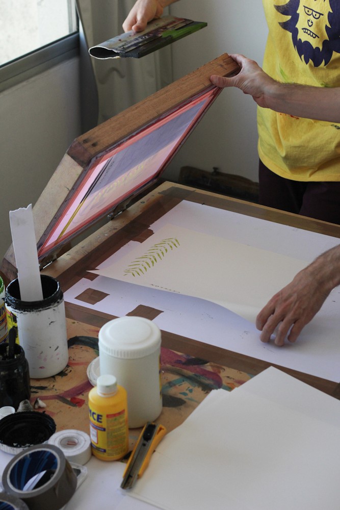
Screen printing was applied on handmade paper, using leaves collected on-site to create natural patterns and reliefs on the paper through a press. The result is a warm, intimate, and artisanal finish that reflects the spirit of the place.